Feder

Eight years shaping a visual world for an electronic artist.

A long-term visual direction spanning identity, release artwork, physical editions and campaign communication — evolving with the music without losing its authorial thread.

ART DIRECTION · IDENTITY · MUSIC CAMPAIGNS
2013 — 2021
CONTEXT / ROLE / CONSTRAINT

The problem behind the surface.

01 / CONTEXT

Feder’s releases moved through distinct musical and visual chapters. The work needed to give each release its own atmosphere while preserving a recognisable relationship between type, image and mystery over time.

02 / CONSTRAINT

A long-running artist identity cannot be one repeated key visual. It has to evolve across artwork, photography, typography, video and live communication without becoming disconnected from the artist.

03 / MY CONTRIBUTION

I developed Feder’s visual direction from the first releases through international campaigns, shaping the identity, artwork and campaign language across digital and physical formats.

01 / EVOLVING IDENTITY

A stable signature with room for different eras.

The Feder lettering is distinctive enough to remain recognisable at a glance, while its construction leaves space for each release to change tone around it.

Feder wordmark construction and variations
01

The wordmark system provides the stable thread between changing campaigns.

Feder angular monogram
02

A compact signature extends the identity beyond the full name.

Feder wordmark
03

The full wordmark remains legible across release and campaign formats.

03 / PHYSICAL RELEASE

The visual world becomes an object.

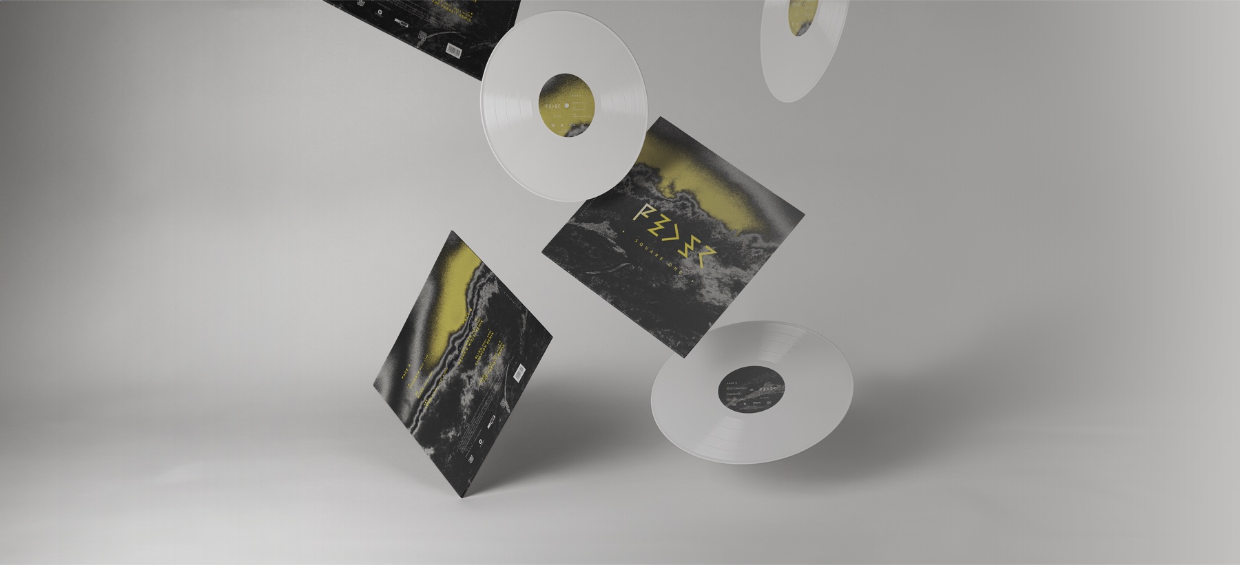
Square One carries the campaign language into sleeve, label and vinyl. The physical edition makes scale, material and sequencing part of the art direction.

Feder Square One vinyl and sleeve
01

The Square One vinyl edition translates the direction into a complete physical object.

KEY DECISIONS

Clarity came from choosing what the system should do.

  1. 01

    Build an identity that could change

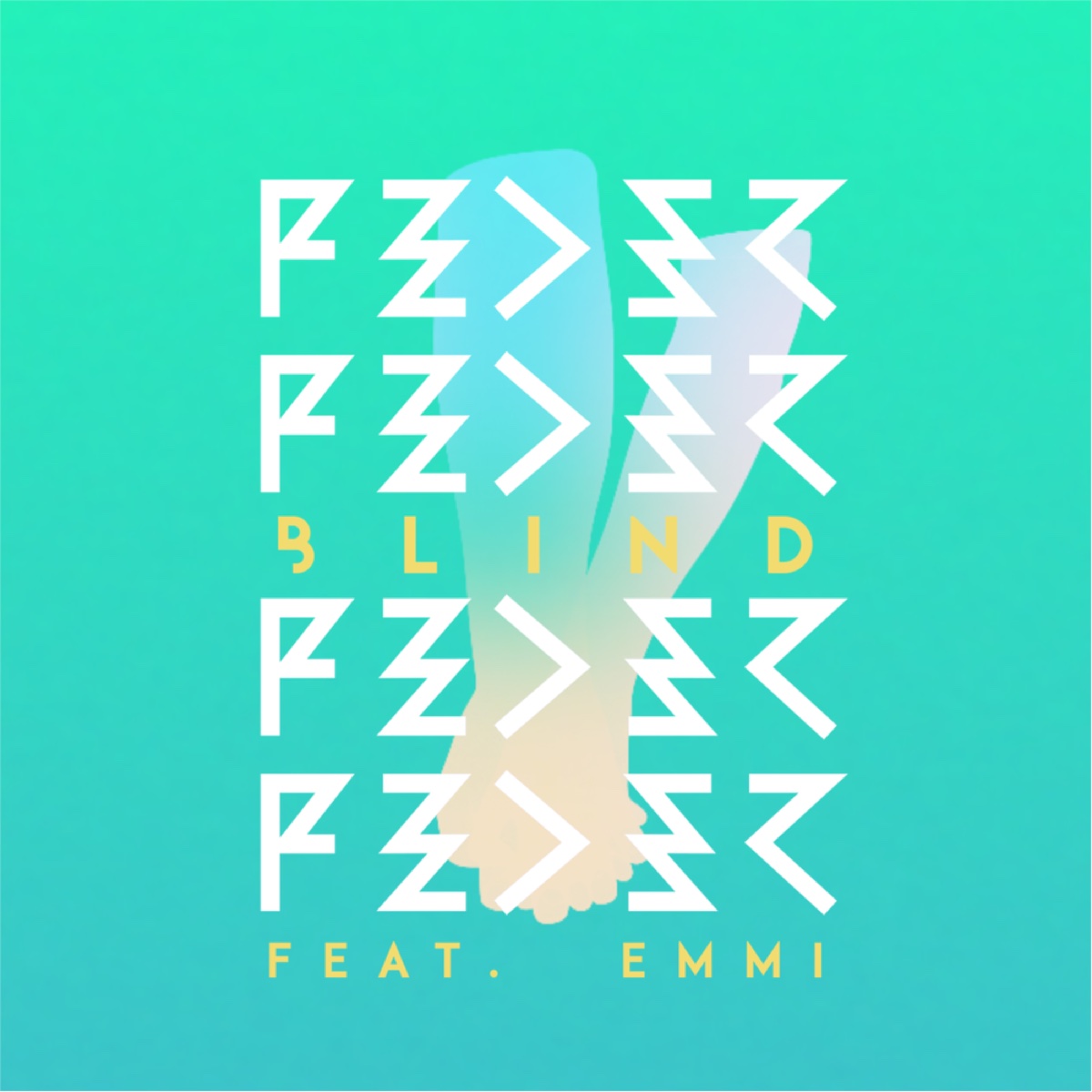
    The angular wordmark acts as a recognisable anchor while imagery, colour and composition move with each release.

  2. 02

    Give every release one strong visual idea

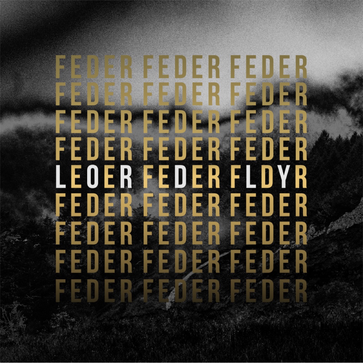
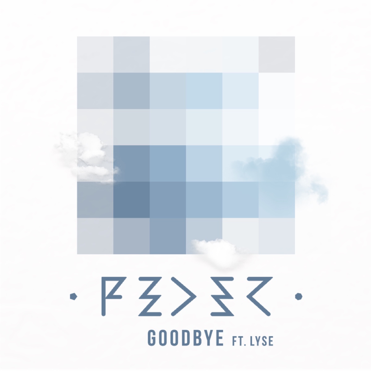
    Blind, Goodbye and Lordly each establish a distinct world instead of repeating one campaign template.

  3. 03

    Carry the direction into physical form

    The Square One vinyl edition turns the visual language into an object, not only a digital cover.

WHAT THIS MAKES VISIBLE

A long-term artist identity able to change with the music while remaining recognisably Feder.

Long-term art direction

Evolving identity

Release campaigns

Physical edition

NEXT PROJECTGaming La Kour