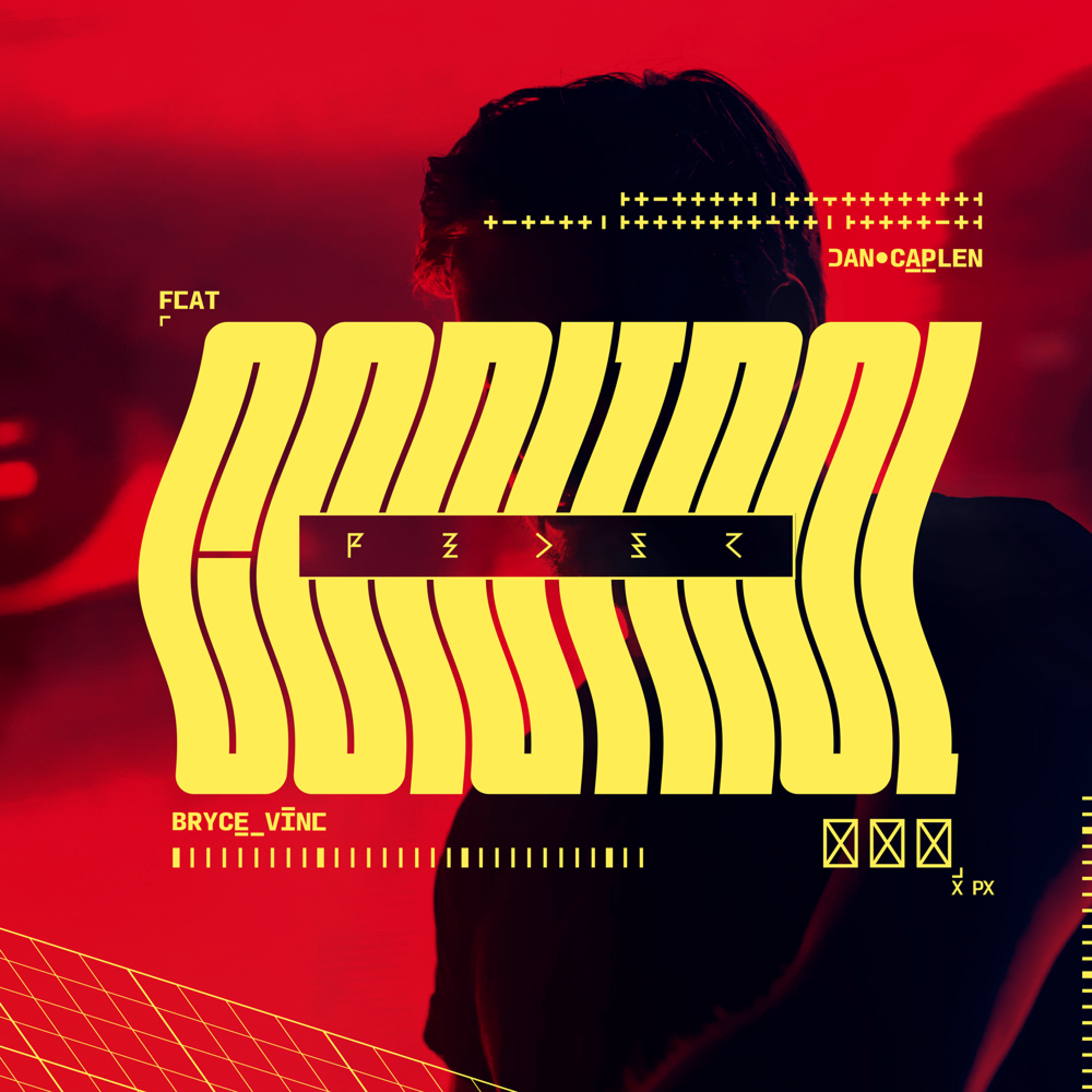
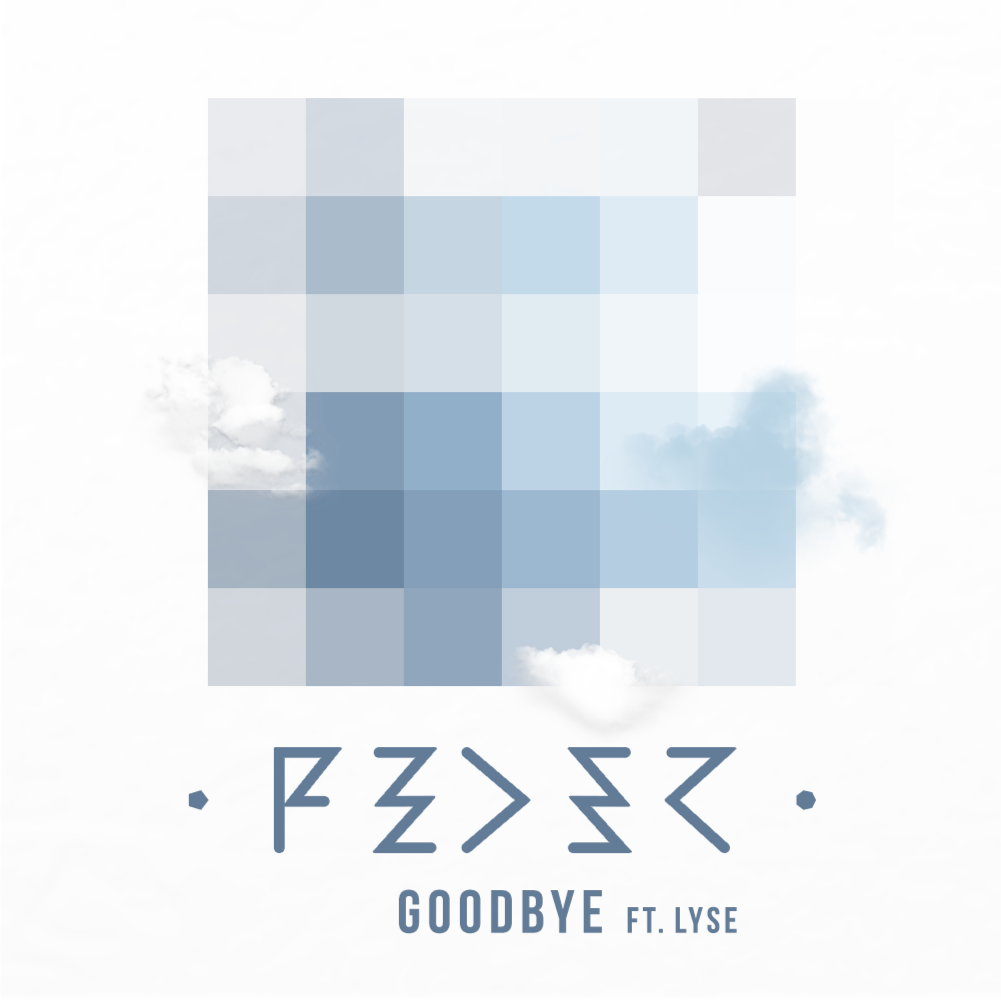
Goodbye ERA
J’ai rencontré FEDER (AKA Hadrien Federiconi) qui officiait en temps de Directeur de Programmation dans le club Paris Paris, à Opéra.
Après avoir conçu son logo sur un bout de feuille dans la cave de ce même club, il m’a recontacté pour concevoir la pochette de son premier single, Goodbye.
C’était sans compter son succès fulgurant dans toute l’Europe à l’été 2014.
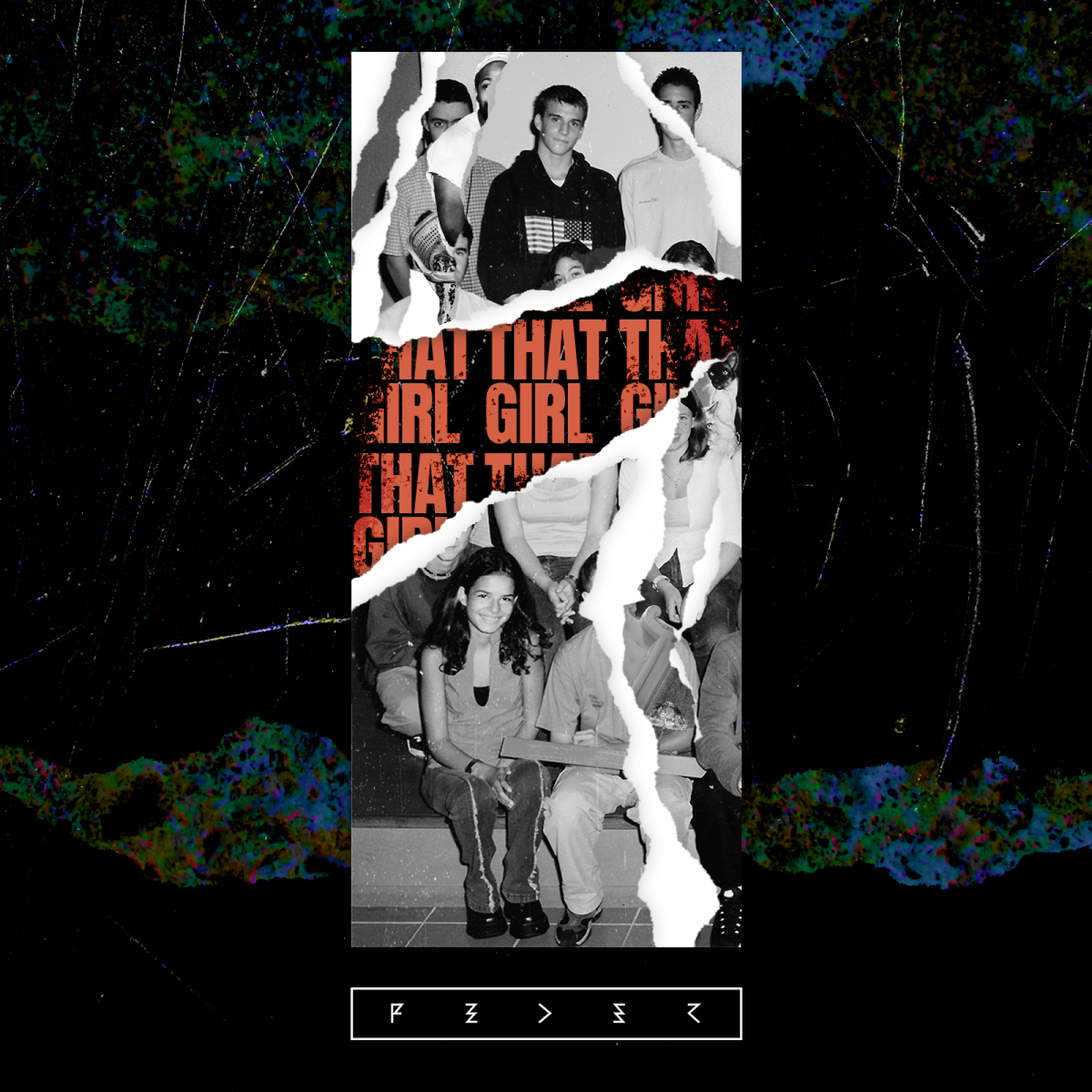
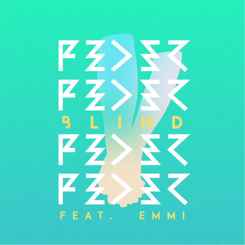
Blind ERA
Son deuxième single, Blind sorti en 2015, se voulait plus intismiste, plus mature.
Dans la continuité de Goodbye, j’ai souhaité rendre la pochette minimaliste au possible et je me suis permis d’y cacher un petit jeu de mot avec Blind (Aveugle en français ou Stores)
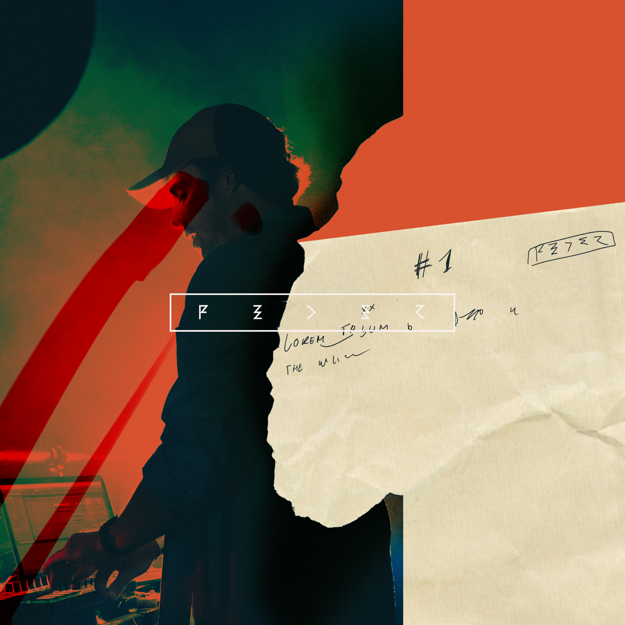
Lordly ERA
Peu de gens le savent, mais parallèlement à Goodbye, FEDER préparait déjà un son à l’ambiance sombre, parfait pour les clubs.
Dans une version instrumentale sortie en 2014, ce morceau a été ensuite retiré pour que Alex Aiono y pose sa voix.
J’ai donc choisi une esthétique léchée, sobre et élégante, réminiscente de cette vision du club que FEDER avait.

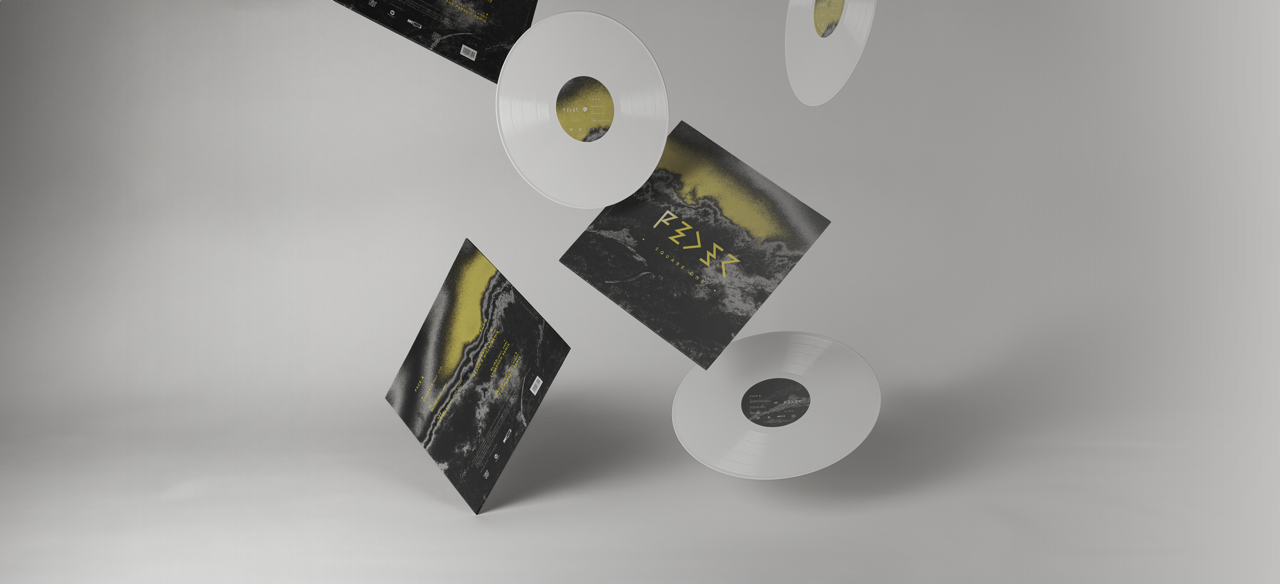
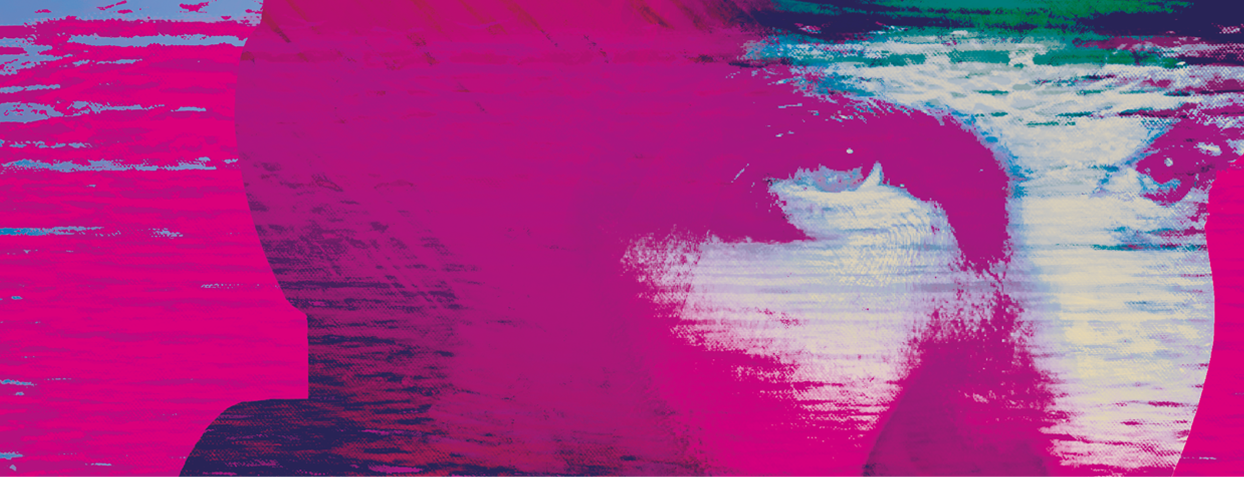
Pour compléter la trilogie de singles sortis, FEDER m’a confié la tâche de la réalisation d’un vinyle.
Sobrement intitulé Square One, qui fait rappel à la première page d’un livre, c’est également une référence
directe à l’une des chansons de l’album X&Y de Coldplay.